Two short tutorials: water effect and glowy text
Jul. 28th, 2025 09:30 pmBecause I felt like it, I wrote up a few quick tutorials for icons that were either difficult or unusual for me this year, where I think writing it up might help me reproduce the effect and be enjoyable to read for others. Here are the first two. I hope you like them!
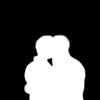
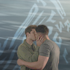
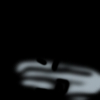
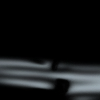
These icons:

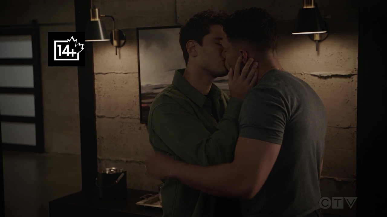
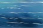
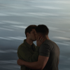
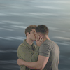
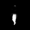
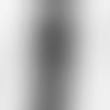
This is the cap (open or download the image to see at full size):
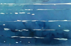
1. I used this texture:
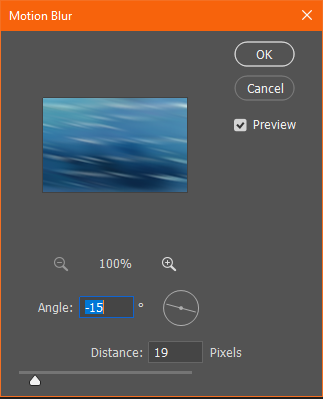
2. and applied a motion blur filter with an angle of (more or less) -15 degrees and a distance of 19 pixels:
 ->
-> 
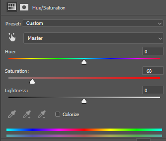
3. and desaturated it:
 ->
-> 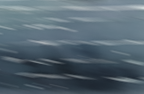
4. then I masked the two subjects out of the original cap and sharpened them and put them above the background:
 +
+  ->
-> 
5. they were too dark, so I duplicated them and set the second layer to Linear Dodge (Add) (100% because they were *that* dark):
->
6. they were still too dark, so I duplicated the layer again, inverted it (black background only for visualization purposes), and set it to Soft Light 100%:
 ->
-> 
Now they're light enough not to get overshadowed by the background! \o/
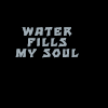
7. On to the text. The color is a light, almost grey shade of blue (#a0adb5) that I picked out of the background, and the font is Tarzan at 10pt with a kerning of 180 (black background only for visualization purposes):
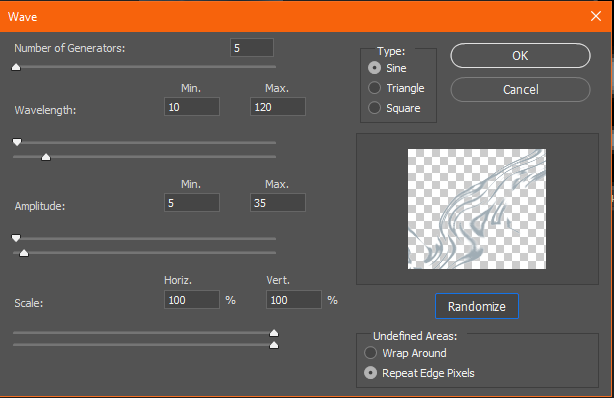
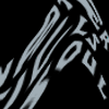
8. Then I distorted the layer with the wave function. For that you have to rasterize the layer. (I duplicated it so I would still have the text layer later. The original text layer I set to invisible.) I have no idea what settings I used, I usually click randomize until I like the result:
 ->
->  ->
-> 
I put the distorted text layer behind the subjects.
9. I still thought it was too dark, so I took this texture by dragonslayer, desaturated it, and set it to Hard Light 32% above all other layers:
 ->
->  ->
-> 
10. Now for the final touch of the watery look, I wanted some water effects in front of them, too, so I painted a few lines with the same color I used for the font into an empty layer (black just for visualization), and masked away some of it in front of their skin so it wouldn't turn blue:
11. I duplicated that painted layer and stretched it out (I usually use Free Transform for everything):
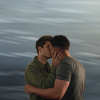
12. I set the first one to Color 100% and the second one to Color Dodge 26%, to get the effect of a water ripple reflecting on their bodies, and that's it! Final layer palette and result:
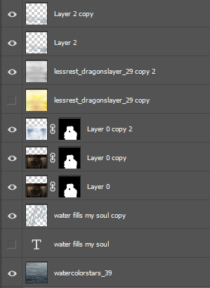 -
-
The important part in this icon is to make the person stand out and to clean up the background. I always make sure not to leave any distracting details in icons.
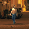
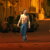
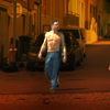
This is the cap of Fitz sleepwalking through St Pierre in his pyjama pants (open or download the image to see at full size):
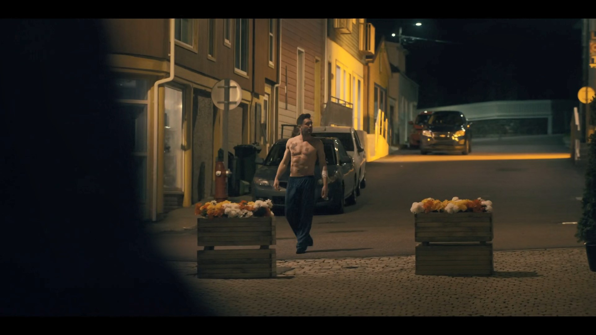
1. First I cropped it so he's in the middle:
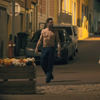
2. Then I removed the raised flower bed (or whatever that is) in the lower left corner. I don't remember how exactly I did this, but I suspect I painted over it with the clone brush with the empty street from his other side:
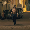
3. Then I made him stand out more by masking away everything apart from his body. As you can tell I just did this haphazardly with a small hard brush. Then I set this layer to Linear Dodge (Add) 100% :
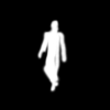 ->
-> 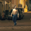
4. I thought his pants were still too dark, so I copied the layer again and removed the mask for his upper body. I set this to Linear Dodge (Add) 100% as well:
 ->
-> 
Yay, now he's lighter than the background!
5. Now for coloring. I wanted the background to be more uniform and also warmer. So I added a plain brown color layer (#9a725a) on Overlay 100%. I put this layer in front of the background layers but behind the subject layers from steps 4/5:
 ->
-> 
6. I liked the way the street lights illuminate the scene from the far back, so I added more colors to enhance this (but not too much, he has to stay in focus). The colors are yellow on top (#ffcf16) and orange on the bottom (#ff8937). The middle is transparent - I only added a white background here to make it easier to see for the tutorial. I used the same mask I had already made for his body, just inverted, so his body wouldn't get affected by the colors. The layer is then set to Multiply 100%:
 +
+  ->
-> 
7. I thought he still wasn't standing out well enough yet, so I added a bit of black behind him. I used the same mask as before and set it to Multiply 63%:
 +
->
+
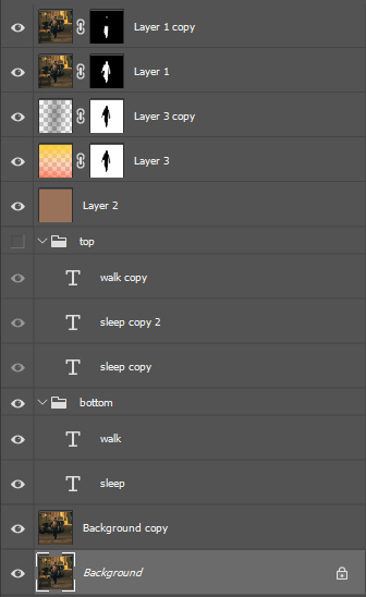
-> 
8. Textwork! I couldn't think of anything good to say, so I just added the words "sleep" and "walk". I put each on their own layer. I used the font Franklin Gothic Condensed BT at 18 and 12 pixels, the colors are yellow (#ffde00) and orange(#ff6600). I set both layers to Color Dodge, around 70% opacity:
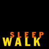 ->
-> 
9. I thought the top half could also use some text, so I duplicated the text layers and moved them around. I didn't change size or color. I set those three all to Color Dodge 61%:
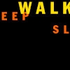 ->
-> 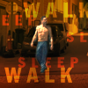
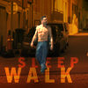
I then decided that the text at the top wasn't well readable and detracted from the depth of the street background, so I did not use that layer group after all. So I set those to invisible and called it done! Final layers and result:
 -
-
I enjoyed writing these up, I hope you enjoy reading them! <3
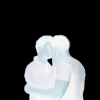
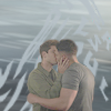
These icons:
icon one - Lone Star icon with water effect
This is the cap (open or download the image to see at full size):
1. I used this texture:
2. and applied a motion blur filter with an angle of (more or less) -15 degrees and a distance of 19 pixels:
-> 3. and desaturated it:
-> 4. then I masked the two subjects out of the original cap and sharpened them and put them above the background:
+ -> 5. they were too dark, so I duplicated them and set the second layer to Linear Dodge (Add) (100% because they were *that* dark):
->
6. they were still too dark, so I duplicated the layer again, inverted it (black background only for visualization purposes), and set it to Soft Light 100%:
-> Now they're light enough not to get overshadowed by the background! \o/
7. On to the text. The color is a light, almost grey shade of blue (#a0adb5) that I picked out of the background, and the font is Tarzan at 10pt with a kerning of 180 (black background only for visualization purposes):
8. Then I distorted the layer with the wave function. For that you have to rasterize the layer. (I duplicated it so I would still have the text layer later. The original text layer I set to invisible.) I have no idea what settings I used, I usually click randomize until I like the result:
-> -> I put the distorted text layer behind the subjects.
9. I still thought it was too dark, so I took this texture by dragonslayer, desaturated it, and set it to Hard Light 32% above all other layers:
-> -> 10. Now for the final touch of the watery look, I wanted some water effects in front of them, too, so I painted a few lines with the same color I used for the font into an empty layer (black just for visualization), and masked away some of it in front of their skin so it wouldn't turn blue:
11. I duplicated that painted layer and stretched it out (I usually use Free Transform for everything):
12. I set the first one to Color 100% and the second one to Color Dodge 26%, to get the effect of a water ripple reflecting on their bodies, and that's it! Final layer palette and result:
- icon two - sleepwalking Fitz
The important part in this icon is to make the person stand out and to clean up the background. I always make sure not to leave any distracting details in icons.
This is the cap of Fitz sleepwalking through St Pierre in his pyjama pants (open or download the image to see at full size):
1. First I cropped it so he's in the middle:
2. Then I removed the raised flower bed (or whatever that is) in the lower left corner. I don't remember how exactly I did this, but I suspect I painted over it with the clone brush with the empty street from his other side:
3. Then I made him stand out more by masking away everything apart from his body. As you can tell I just did this haphazardly with a small hard brush. Then I set this layer to Linear Dodge (Add) 100% :
-> 4. I thought his pants were still too dark, so I copied the layer again and removed the mask for his upper body. I set this to Linear Dodge (Add) 100% as well:
-> Yay, now he's lighter than the background!
5. Now for coloring. I wanted the background to be more uniform and also warmer. So I added a plain brown color layer (#9a725a) on Overlay 100%. I put this layer in front of the background layers but behind the subject layers from steps 4/5:
-> 6. I liked the way the street lights illuminate the scene from the far back, so I added more colors to enhance this (but not too much, he has to stay in focus). The colors are yellow on top (#ffcf16) and orange on the bottom (#ff8937). The middle is transparent - I only added a white background here to make it easier to see for the tutorial. I used the same mask I had already made for his body, just inverted, so his body wouldn't get affected by the colors. The layer is then set to Multiply 100%:
+
->
7. I thought he still wasn't standing out well enough yet, so I added a bit of black behind him. I used the same mask as before and set it to Multiply 63%:
+
->
8. Textwork! I couldn't think of anything good to say, so I just added the words "sleep" and "walk". I put each on their own layer. I used the font Franklin Gothic Condensed BT at 18 and 12 pixels, the colors are yellow (#ffde00) and orange(#ff6600). I set both layers to Color Dodge, around 70% opacity:
-> 9. I thought the top half could also use some text, so I duplicated the text layers and moved them around. I didn't change size or color. I set those three all to Color Dodge 61%:
-> I then decided that the text at the top wasn't well readable and detracted from the depth of the street background, so I did not use that layer group after all. So I set those to invisible and called it done! Final layers and result:
- I enjoyed writing these up, I hope you enjoy reading them! <3